Glow: Project 1
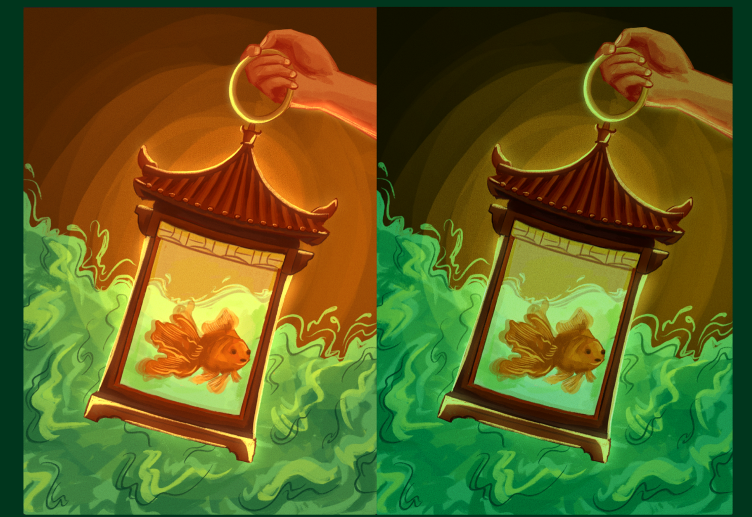
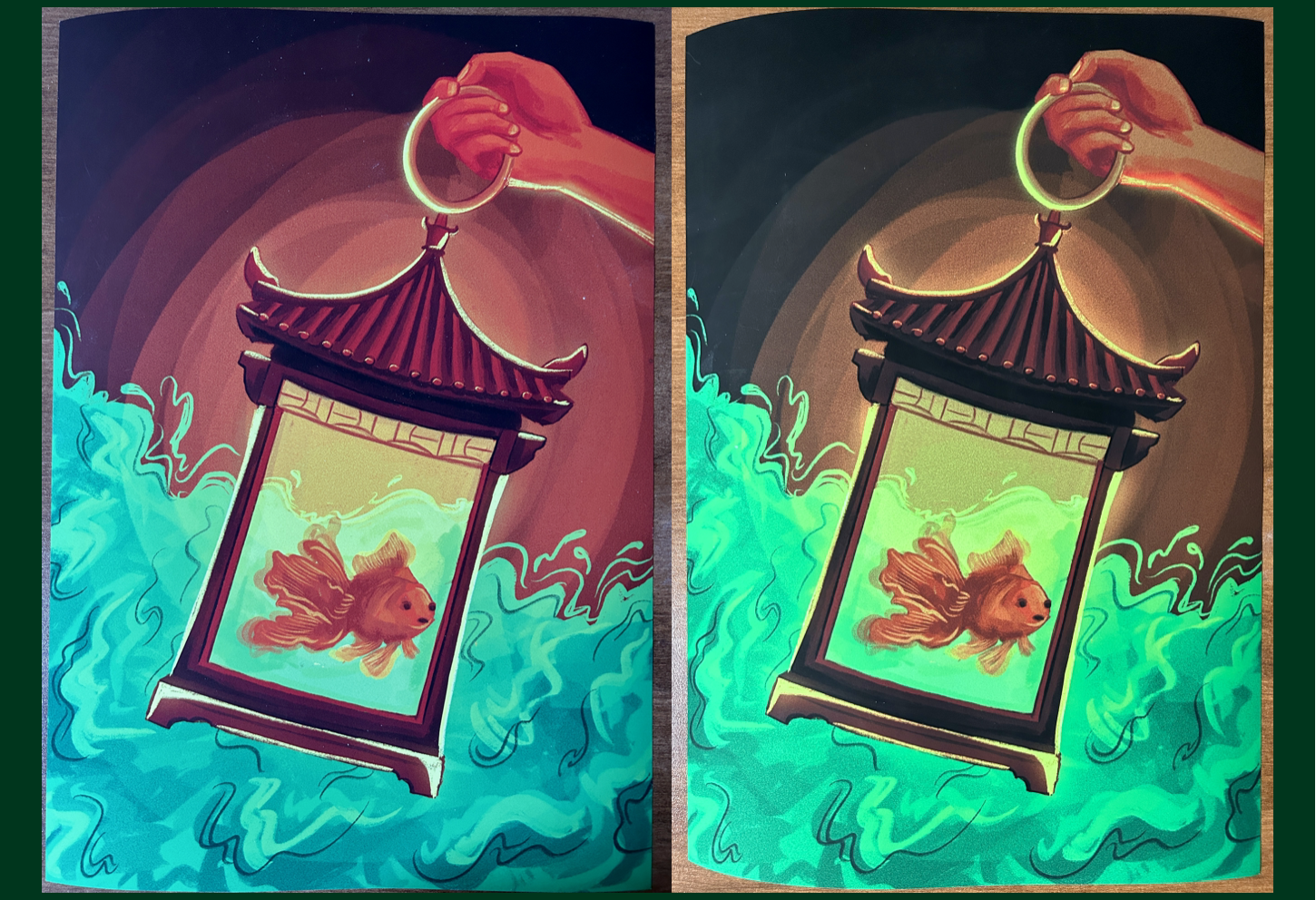
For this first project, the prompt focused on the use of colors, especially with the difference between RGB and CMYK color modes. I created two versions of the same goldfish in a lantern: using colors, I wanted to modify the tone of each piece to signal warmth and danger respectively. It was also interesting to see how the colors translated from the screen (CMYK) to the print version (RGB).

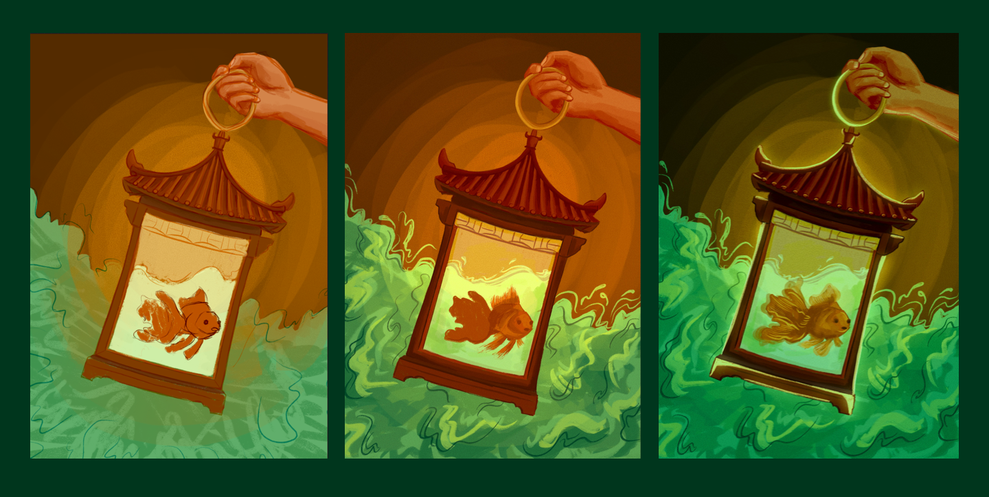
I sketched and rendered the drawing in Procreate and then used Photoshop's blending modes and layers to play around with the colors. Below are some progress photos.
